
2025 in charts
The year that was
2025 was a year of major shocks, yet from a macro perspective, things went much better than we had any right to expect. The world economy and markets adapted to the biggest trade policy uncertainty shock since the 1930s, war in the Middle East and the wholesale collapse of US institutions and state capacity.
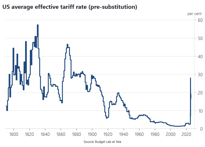
The US effective tariff rate rose to the highest level in over 100 years, one of the biggest peacetime tax increases in US history:
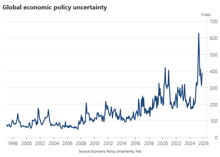
US trade policy resulted in a surge in global economic policy uncertainty to unprecedented levels:
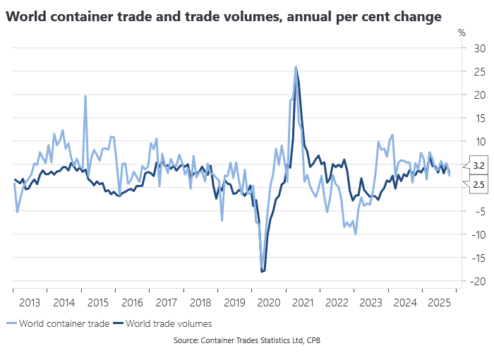
Yet growth in global trade volumes remained resilient to the shock, pointing to significant trade diversion induced by US tariffs:
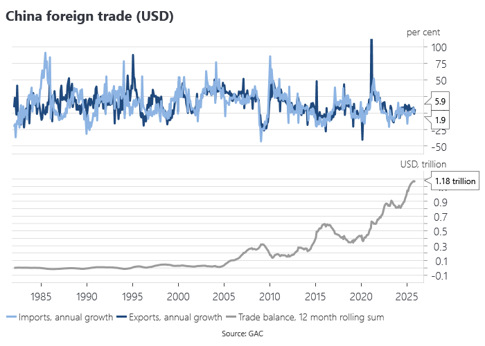
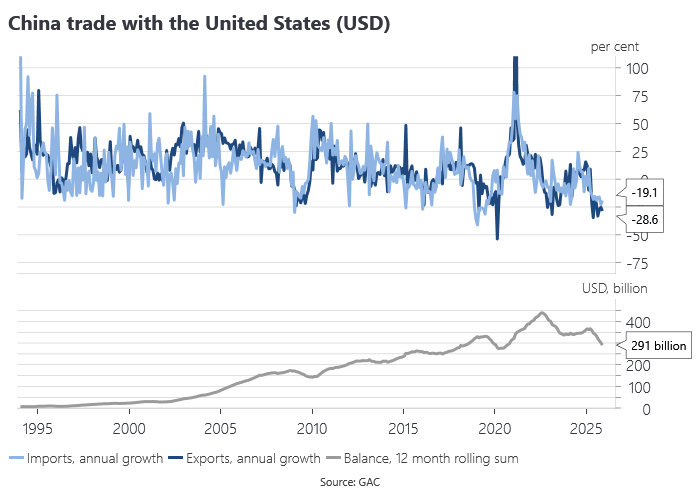
China’s trade with the world as a whole powered ahead even as US imports from China collapsed:
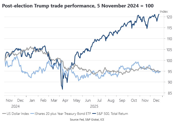
The pre- and post-election ‘Trump trade’ came unstuck with April’s Liberation Day tariff shock, prompting a generalised run on US dollar asset markets, but US equities would go on to make new highs into year-end:
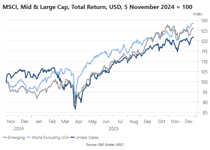
US stocks underperformed their global peers, in what was perhaps the biggest surprise of 2025, although consistent with the idea that tariffs and the associated policy uncertainty were first and foremost a problem for the US rather than the rest of the world:
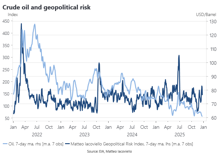
Conflict in the Middle East culminated in the US bombing of nuclear facilities in Iran in June, yet you would not know it looking just at the oil price, which declined in the second half of the year:
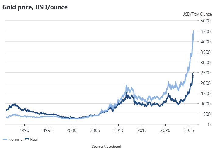
The gold price made record highs in nominal and real terms. Analysts explained the run-up in terms of the usual laundry list of gold positive factors, but these explanations were hard to square with developments in the economy or other asset markets:
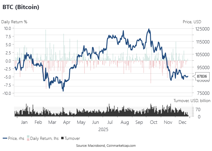
BTC benefited from a more permissive policy environment in the US, but remains very sensitive to risk appetite and the cycle:
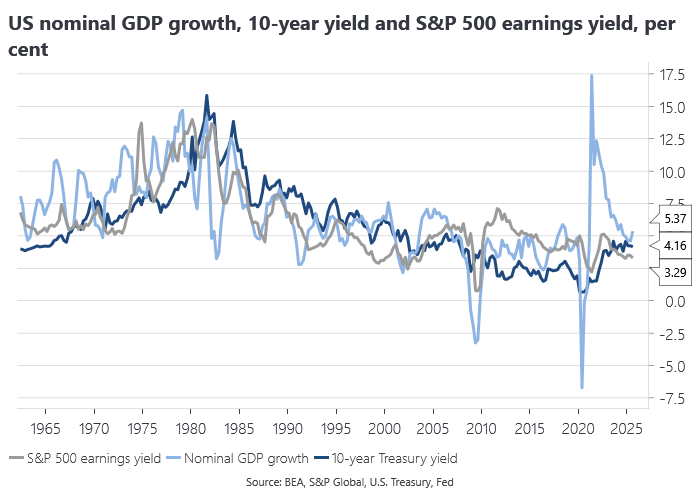
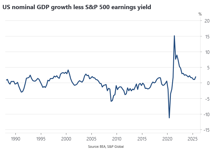
The US 10-year Treasury yield became cheap relative to equities, although 10-year yields remained rich relative to nominal GDP growth, which accelerated in the third quarter, leaving a more positive NGDP gap based on Mike Sandifer’s model:
These were just some of the charts we highlighted during the course of 2025. If you want to see what these and other great charts look like in 2026, become a paid subscriber before January 1 and enjoy 20% off a paid subscription forever.